Whats style is your business card?
Hello xx
I’m running out of business cards and have a dilemma I’d like some help with please.
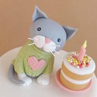
My current business cards have a picture of one of my cakes on which has served me well, but it’s a cheerful birthday cake and I’m now starting to do a lot more Wedding cakes than I did before so thinking my new cards could be a little more sophisticated and eye catching to brides but I don’t want to exclude celebration cakes either.
So I was thinking……….what does your business card look like? and is you business mixed or do you do mostly wedding or celebration cakes.
I’m wondering if I have a plain card with no images on……….??????
Help please………xxxxxxxxxxxxx
karen,Gwynedd
40 Replies
I designed business cards Karen in the thought that when I retired from my full time job, I’d do part time caking. Decided against. I only printed a couple off my computer. At any rate, I just found a couple of hand drawn images of cakes on the net, and put them on the left hand & right hand corner of the card, with my cake name in the middle. I wanted it fun, but still professional looking. I didn’t want to put any pics of my cakes on the card, cause as I got better, so did the cakes…which meant changing/re-doing the cards. On be back of the card was info…what I made…celebration cakes etc., contact info and such. There’s a plethora of images on the net to choose from.
Hope his helps. :o)
Creativity is God's gift to us. Using our creativity is our gift back to God. Clarky's Cakes 😎
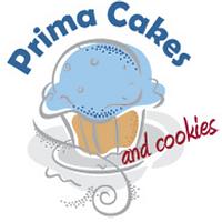
Thanks June xx I thought these two were nice, which I’ve mocked up. Your right about not putting cakes on that will show how you’ve improved. 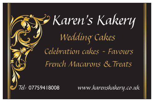
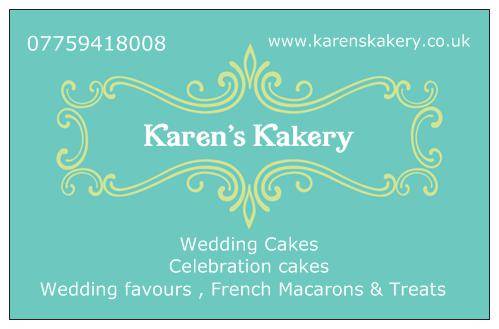
and the last one is my current one……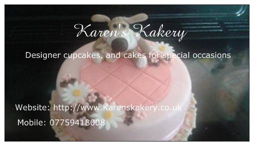
karen,Gwynedd
Out of all 3 Karen, for me #1. It’s classy…very professional. Not a fan of the green colour on the 2nd, although I like the gold framing around your name. And the bottom card is cute…it lend itself more towards children’s cakes. At least, that’s what I see when I look at it.
Creativity is God's gift to us. Using our creativity is our gift back to God. Clarky's Cakes 😎
Thanks June xx Spot on what I was thinking…..I really like the black and gold. And you’re right about the last one, I totally agree it says children’s cakes, which has got me lots of orders, but I think I’ve done enough practice now to be able to allow myself to look a little more professional. Thank you for all your help xx I really appreciate it. It’ll be interesting to see if anyone else has any thoughts or agrees with us xx
karen,Gwynedd
No problem Karen…always like to help. Yes, it will be interesting to see some other feedback from others here…
Creativity is God's gift to us. Using our creativity is our gift back to God. Clarky's Cakes 😎
I like the design of #2 the best, but I would like it more if the background was a different color.
Jenniffer White, Cup a Dee Cakes - http://cupadeecakes.blogspot.com
Thanks Jennifer x I can see this is going to be interesting xx
karen,Gwynedd
I like the second one best too – I think it has a more modern look :-)
Julia Hardy
I like the first one best. Like June said it is very classy.
Well Karen…. so far it’s 3 against 2…..
Creativity is God's gift to us. Using our creativity is our gift back to God. Clarky's Cakes 😎
