New CakesDecor Features #13: Mobile Navigation Update
Hey all,
as I mentioned in the previous article, we are working on CakesDecor actively again, but since some back-end stuff was really outdated, it took us more time to update it and fix the bugs than we expected.
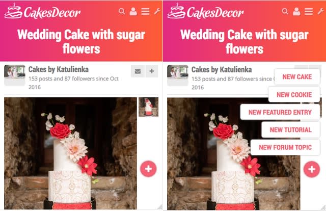
I’m glad I can show you something that is “visible” for users finally: New Mobile Navigation.
Old mobile navigation was covering the logo

In the new mobile navigation, the logo is on the left and the navigation is not covering the logo

The “+” Button is now on the bottom right (easier to reach comparing to top position it was before) and it is larger (for those with thicker thumb it’s easier to tap :) )

I hope you will like this small adjustment.
-- Michal, http://cakesdecor.com | My Facebook: http://www.facebook.com/michal.bulla
14 Comments
Thank you 😊
Thanx 👍👍👍
Thank you, Michal! 🤗
Clara
Awesome!!! Thank you, Michal!!! 🤗
SweetUs
😘
Cristina🍰
Aha ,but the daily top 15 and the daily top 3 are not working now????
JEtaarten-Puur genieten
Thank you!!!
Judith – it should be ok now ;)
-- Michal, http://cakesdecor.com | My Facebook: http://www.facebook.com/michal.bulla
Is the site blocked now? There are several cake with more than 24 hours at the home page…
Elisabete Caseiro, Portugal, https://www.facebook.com/BetySugarland


