Metamorphosis
Metamorphosis
 expand all pictures
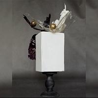
This is my “stayhome” activity, which I named “Metamorphosis” :).
I was playing with the design of the modern cake.
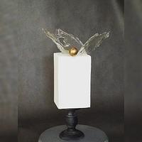
At the beginning there was a very simple, minimalistic design, with a clear isomalt topper and a gold chocolate sphere ( design 1, second photo).
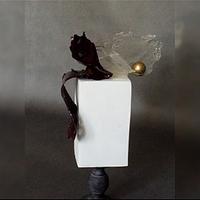
Then I added more contrast → black isomalt piece ( design 2, third photo).
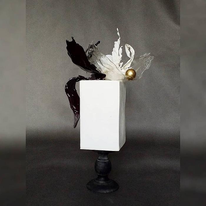
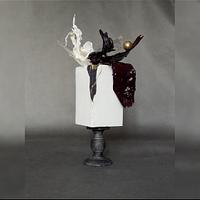
At last I completed the design with opaque white and black rice paper and wafer paper pieces to give a movement to it and I added another chocolate sphere ( design 3, first photo ).
There is a kintsugi effect too ( because I love kintsugi 😊)( design 3, fourth photo ).
Lubica
18 Comments
Classy and gorgeous!
Sugar Sugar by SSmiley
They are all gorgeous and deserve to be in the Museum of Modern Art! :)
The Garden Baker
Beautiful!
Beautiful
Wow! Fabulous
Beautiful
Darina
Thank you so much, ladies :)
Lubica
Beautiful!!!
RadmilaB
Wow! Gorgeous! I love it!
Perfectly done!
Awesome topper!!!
Clara


