A Cupcake Bouquet
A Cupcake Bouquet
 expand all pictures
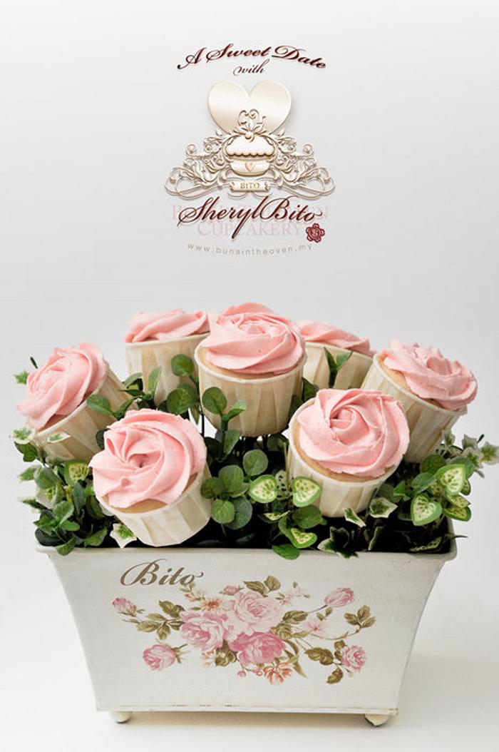
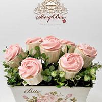
I did this as a sample; feedback received was that the overall design was rather simple and needed more elements to make it look more complete.
I actually kinda love the simplicity of the design. Clean and fresh. But I guess I can try to spice it up a little bit.
What do you guys think?
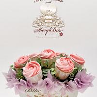
Updated The second pic is the dolled up version of the same design. I still think that less is more :)
Bito, Handmade with Love..just for you!, www.bunsintheoven.my
9 Comments
I like the simplicity of the design too ;)
-- Michal, http://cakesdecor.com | My Facebook: http://www.facebook.com/michal.bulla
thanks Michal! I have uploaded the ‘dolled up’ version :)
Let’s hope the client approves of version 1.1.
Bito, Handmade with Love..just for you!, www.bunsintheoven.my
Oh I prefer the second picture – although the first one is also very nice, I just think the tissue paper finishes it off lovely!
https://www.facebook.com/tortacouture | Perth, Scotland
simplicity is what makes it beautiful
Deemz, https://www.facebook.com/pages/Deemaz-cupcakes-etc/206346586043185
i actually like them both! not too much on the second one…still simple but at the same time elegant! well done!
thank you tortacouture, Deema & thecupcakesalon. The dolled up version is growing on me :)
Bito, Handmade with Love..just for you!, www.bunsintheoven.my
This is beautiful!
Love the first. The pink rosebuds stand out against the green. The second is lovely too, but looks like a bouquet.
I love the little vase too :)
Radhika, Singapore, http://sinsationscakes.wordpress.com/
Lovely!!! xx
CUPCAKES & DREAMS My facebook: https://www.facebook.com/pages/CUPCAKES-DREAMS/115882865103239?ref=hl
